Page layouts
Page layout building blocks and how they are used.
Page building blocks
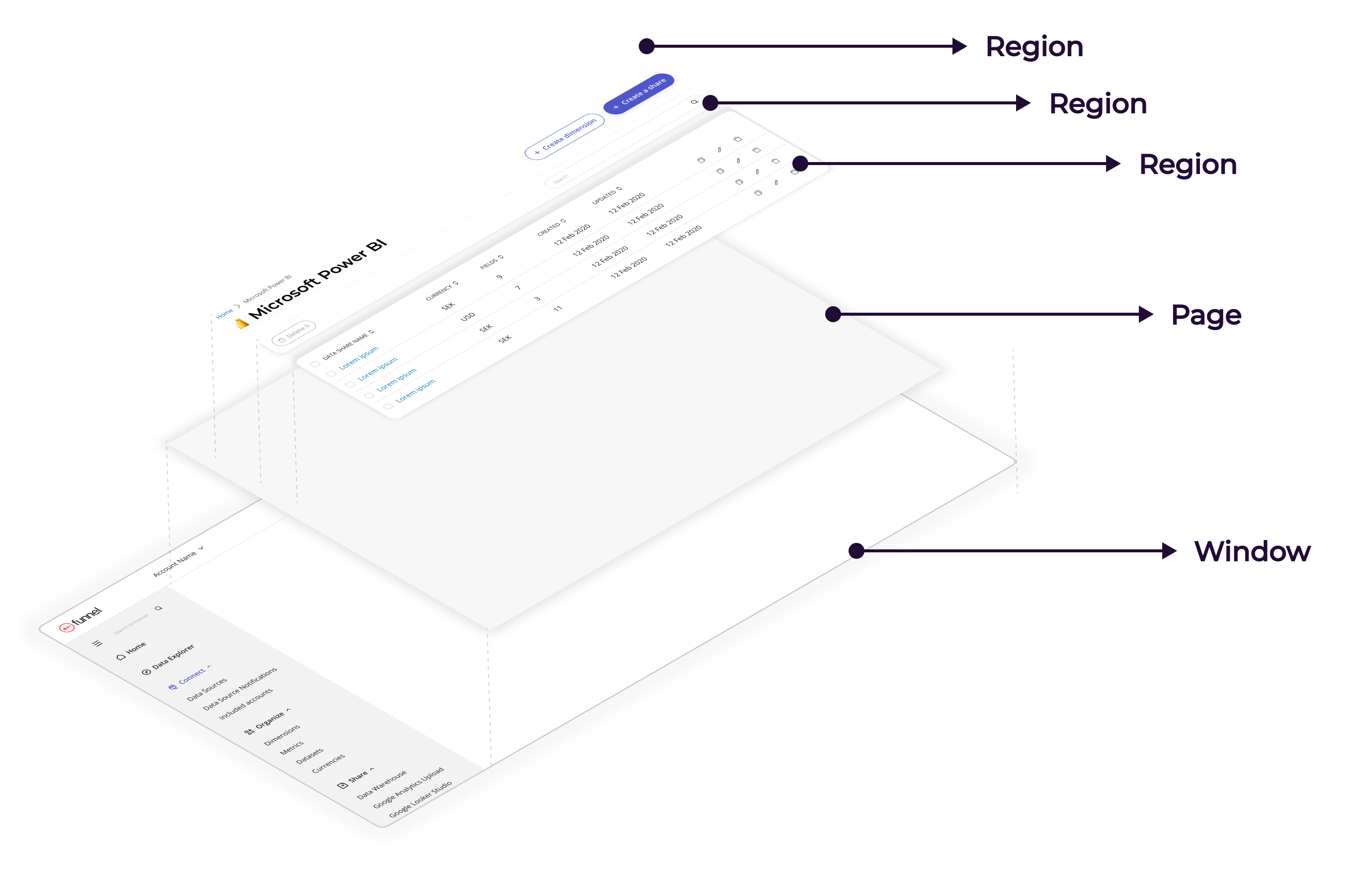
Our layouts are built up from a number of building blocks.

Grid
The grid is a way of organising content in columns.
- 12 columns page layout.
- provides more flexibility on how to structure a page.
- makes it easier adjust to different screen sizes.
- tailwind classes.
Example:
- 1 column on smaller screen sizes.
- adjust to 2 columns on larger.
fun-grid-gapsets a gap that adjusts between screen sizes.
Window
The ‘window’ is the entire browser window including navigation.
Page
A ‘page’ is the background surface of the application, excluding navigation. It is contained in the window. A page:
- contains one or more regions.
- Has a grey background.
- Does not have any margin, padding or borders.
Use the fun-page class to set the page background colour.
Region
A ‘region’ is an area on a page containing content of some kind. It can contain a header or a filter section or the main body content.
A region:
- Is 100% width.
- Has a standardized spacing on the left and right.
- May contain a 12-column grid.
Use the fun-region class to set the region spacing. To create the grid you can use these classes:
Pane
A ‘pane’ is used to organize content inside a region.
- Panes have a white background, rounded corners and padding.
Use the fun-pane class to style panes.
When using within a grid use col-span to control how many columns it spans. Example with using full width:
Standard page layouts
These are page layouts that are common and should have a standardized layout and behaviour.
List Pages
List pages show a list of items. They can be used purely for information or as navigation pages.
- Primary action button must be in the page header.
- The page should have a search box.
- Should be full width.
- Proper links should be used for navigation (
aelements) to preserve proper browser behaviour. - Keep the number of columns to a manageable minimum.
- Consider using a drawer (an expandable row) to show further details about an item if there is too much information to show on a single row.
- The list may contain secondary actions and navigation for each individual item:
- Actions must apply to the item in the row.
- icon buttons should use the ‘quiet’ variant of fun-button.
- icons should be ordered from least impactful to most impactful, for example delete should be last, because it is a very destructive action.
- Actions must be right-aligned.
- Do not have more than 3 actions; consider an overflow menu or another alternative approach.
- The actions column should not have a header.
- Add
space-x-smto the element containing the action buttons for consistent spacing. - Avoid using text buttons as list item actions.
Table controls region
- Action buttons should be placed to the left;
- Search bar + filter-related features should be placed to the right;
- When the page has “action buttons” + “search” they align horizontally;
Details pages
Details pages show information about a particular item or entity, for instance a single custom metric, data source or Tableau view.
- The body region should use a 12 column grid.
- Information should be organized into one or more panes.
- Action buttons that affect the entire item such as edit or delete must be placed in the header.
- Contextual action buttons may be placed in panes, but sparingly. Consider if it should really be in the header.
Refer to our example pages for implementation details.
Edit / Create pages
Edit and create pages are used for editing the properties of a single entity, for instance a custom dimension or data warehouse export, or for creating new items.
- The body region should use a 12 column grid.
- Information should be organized into one or more panes.
- The page must have Save and Cancel action buttons in the header.
To avoid super wide forms you could limit the width of the panes on large screens. Example with using full width on smaller screens and adjust on larger screens:
Responsive design
All pages should be responsive to different screen sizes. We provide the following breakpoints that can be used as tailwind modifiers:
- sm: 640px
- md: 768px
- lg: 1024px
- xl: 1280px
- 2xl: 1536px
- 3xl’: 2320px


